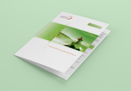
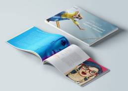
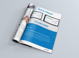
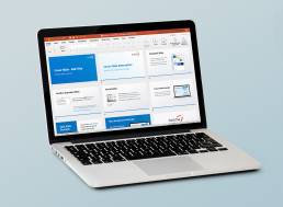
Refreshing a learning technology company's brand identity and website, developing marketing collateral, presentation templates and books.
Assima creates unique corporate learning software and consults on training and change management for global Fortune 500 companies. After a period of growth and change, its identity had become stale and no longer represented the company vision. There was a distinct lack of cohesion between disparate localities. Branding guidelines were bare-boned and poorly adhered to. Further, a tight budget and restrictions on changes elevated the challenge. This presented an opportunity to refresh the company’s identity, whilst updating its processes and enforcing global adoption.
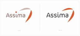
Assima logo refresh
Research began with feedback gathered from staff and clients through surveys, group workshops and 1-to-1 discussions, yielding data on a variety of brand issues. Design related gems were distilled to help identify potential problems with the rebrand effort. Through meetings and presentations with key stakeholders, buy-in was secured early to lower barriers later in the process.
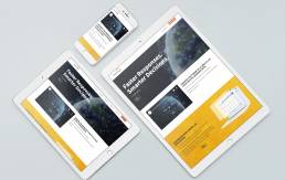
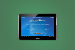
A plethora of existing assets were collated and reviewed, alongside departmental processes, which helped identify gaps and inefficiencies in operations. The creative strategy was clearly defined. The visual identity had to be flexible enough to work in print and digital across a multitude of platforms and formats, including brochures, exhibit stands and print ads, websites, social media and video, and within the UI of each product.
The core design elements were considered first. Basic system fonts were complemented by custom and web typefaces. The logo had to retain its brand equity by remaining recognisable, however minor edits were made to give it a fresh lease on life. Gone were the muted brown and beige hues; replaced by exciting vibrant tones. Each product line was given its own colour set complementary to the corporate palette.
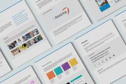
Phased communications were important to raise awareness of the effort and maintain an ongoing buzz. An extensive brand guidelines document was created and core design assets were made accessible online in common formats. To ensure greater adoption, several virtual sessions were held via WebEx, allowing staff to see firsthand what assets were available to them and how best to apply them in their roles. The visual identity was enforced globally, down to the email signature.
Rus has a knack for instantly understanding new technologies, making him stand out from other creatives I’ve worked with. The results he delivers have been consistently of the highest quality. His professional attitude, skillset and approachability make him a great asset to any organisation.
Marketing Manager
Assima UK
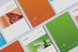
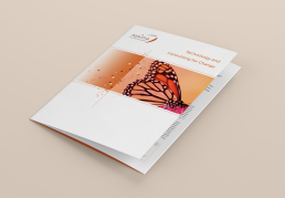
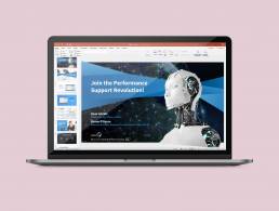
Other creative assets were developed, including document and presentation templates, brochures, slides decks for Marketing, Sales and Partners; deployed via the intranet in staged communications.
The company image was revitalised, as a result, enabling greater opportunities for an enhanced brand. Combined with clear messaging and a new tone of voice, the visual identity helped modernise this innovative company, making it more competitive, building greater trust with clients and improving prospects’ brand perception. Consequently, a streamlined identity caused a greater sense of global community for staff.
